I'm a Software Engineer in the San Francisco Bay Area who transitioned after 15 years of managing the Hospitality and Food Service Industry. I am a parent of two, plus a rescue pup. Often you will find me making Dad jokes and puns, sometimes to my detriment.
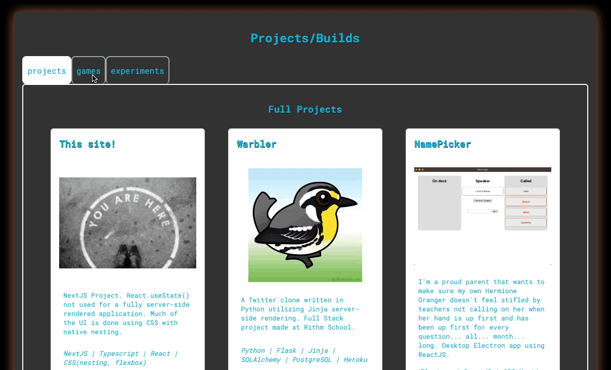
While working on a website with a team, you notice everyone’s habits. Who creates components to remove repetition (hopefully everyone)? Who has a consistent ordering of properties? And how deeply does someone consider their choices? I observed that most of my teammates like to use a button element for anything that looks like a button, even if it is an internal link (link to another page in the website) or external link (link to another website entirely). This tactic works, but it does open you up to some problems.
Semantic HTML is a collection of element tags that are used to describe the usage of the element. A div, for example, is a block of contents where span is a line or row on contents. Usually, people throw everything into a div and CSS their way out of it. Even I do this since span seems oddly specific. These are pretty general and can be used for just about anything. Then, I learned about section and article to describe a particular area of related content that is grouped together and an area of text that stands on its own, respectively.
The reasons we should use semantic HTML are:
- Accessibility - Screen readers leverage semantic element tags to locate what is worth reading.
- Documentation - When writing code, it should always be documented to help describe what is going on in the code for the next person to look at the doc. This could be someone else on your team, you after taking a break and getting some much-needed sleep, or even yourself many projects later.
- SEO - Robots that crawl sites also leverage semantic element tags to understand the layout of a page. A page that is laid out and easy to read the format from the element tags can get your site ranked higher in searches.
Free documentation without being passive-aggressive
Do you remember how everyone said that meaningful variable names are important? HTML elements should be too! You probably already use some of the popular semantic tags: button, form, table, nav. And yes, it’s some more things to memorize. You could look them up as you go as long as you’re close to a computer... which you probably are.
Formatting for SEO may sound kind of boring, but it does help a person understand how all the content is related. Take the h1 - h6 tags. Oftentimes these tags will be used dependent upon the size of the text that you want. This works, but (in the words of Fezzig from The Princess Bride) it doesn’t mean what you think it means. The most important heading on your page is an h1. Think of the Wikipedia page for Abraham Lincoln. The most important title for that page is “Abraham Lincoln.” Within that content, there are titles to mark off “Early Life”, “Political Career”, and “Death”. Each of these headings is an h2. Now maybe in “Political Career” we break that up into “Beginning” and “Presidency”, which are titled in h3 tags. Within “Presidency” we’ll put into h4 tags the headings for the “Presidential Campaign”, “Civil War”, and when he “Invented Rock and Roll.” At least I’m waiting for Wikipedia to approve my content for that last one. But you get the point.
So what’s the deal with all this button talk? A button enacts some javascript action upon data. It can be an API call to submit a form, a button to choose to pick an image to upload, or a button to get a random color. When you want to link to another page, whether it’s within your site or not, you should use an anchor tag (a). One of the telling details you can look for if someone has used a button or an a tag for a link is what happens when you hover over it. Hovering over an a tag displays the URL it links to in the bottom corner of your browser. When it’s a button your user has no hint that they will be going to a new page, let alone where that is. A bad actor could use this lack of disclosure to lead a user to a bad site.
So I’ve added some sample code to show how I would address a button-as-a-link. Here I’ve created components BtnInternalLink, BtnExternalLink, and Btn. These will all share the same style and appearance via the same CSS stylesheet. I’ve then created a new component Button , that allows us to use one component and declare which type we want to use.