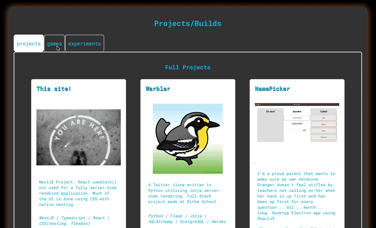
Stateless TabbedSelector
When committing to not using React state, you learn that CSS isn't all that bad.
I'm a Software Engineer in the San Francisco Bay Area who transitioned after 15 years of managing the Hospitality and Food Service Industry. I am a parent of two, plus a rescue pup. Often you will find me making Dad jokes and puns, sometimes to my detriment.
Recently, I did a renovation of my portfolio site. The old one was feeling like too much. I didn’t need navigation to other pages, the load was a bit slow, and the aesthetic was lacking. This new version is my first NextJS project: a single page, server-side rendered React site. There was one aspect I needed to give some special attention to: the presentation of my Portfolio pieces.
In my previous site, I dedicated a whole page to simply listing all the ProjectCards. When I revisited how it looks, I felt like I was looking at a '90s website with visit counters and a whole lot of GIFs (I’m a “hard G” pronouncer, go ahead and judge). I wanted to change the experience to a TabbedSelector , where the user can select a tab for the different types of projects. However, when using NextJS there’s a convention to follow: when using React state, the component and its children must be rendered client-side.
If you’ve worked with client-side rendering a lot, this doesn’t intrinsically feel like a bad thing. But for me: I wanted to lean into server-side rendering. My portfolio is a static site and I wanted to improve the load time. If there was better SEO for me as well, then why not? The personal commitment was clear: all server-side rendered. But how do you create a tabbed selector without using state or a UI library… which will need state? Our good buddy CSS!
Onto the code! Here’s what the markup for the TabbedSelector component looks like. All you’re missing is all of this wrapped in an arrow function and a mapping function projectCards that creates div.project-cards full of the relevant ProjectCards.
      <div className="tabs">

        <div className="tab-selectors">
            <input type="radio" name="tabs" id="tab1" defaultChecked />
              <label htmlFor="tab1"><span>projects</span></label>
            <input type="radio" name="tabs" id="tab2"/>
              <label htmlFor="tab2"><span>games</span></label>
            <input type="radio" name="tabs" id="tab3"/>
              <label htmlFor="tab3"><span>experiments</span></label>
        </div>

        <div className="no-projects-selected">
          <code>No projects selected.</code>
        </div>

        <div className='project-list projects tab-content' id="tab-content--1">
          <h3>Full Projects</h3>
          {projectCards(projects)}
          </div>

        <div className='project-list games tab-content' id="tab-content--2">
          <h3>Games</h3>
          <p>Just a little fun</p>
          {projectCards(games)}
          </div>

        <div className='project-list experiments tab-content' id="tab-content--3">
          <h3>Experiments</h3>
          <p>Fun and experimentation in CodeSandbox.</p>
          {projectCards(experiments)}
          </div>

      </div>
div.tab-selectors is a container for each radio input to be selected, and their labels. After that, we have a div for each type of project: None Selected, Full Projects, Games, and Experiments. The “None Selected” section isn’t really needed. It was created as a default value to show if none of the radio inputs were checked. However, it shall be removed since input#tab1 uses the defaultChecked attribute. Hard coding the checked attribute will ensure that input is ALWAYS checked, so save yourself the facepalm. “Projects” will always be the initially checked radio button, and we can’t uncheck radios so there's no need for the "None Selected" placeholder. Anyway, onto the CSS with comments.
.tabs {
      width: 100%;

      /* styles added to the radio label when selected */
      & [id^="tab"]:checked + label {
        background-color: white;
        border-color: white;
      }

      .tab-content * {
          flex-flow: row wrap;
          -webkit-animation: scale 0.2s ease-in-out;
          -moz-animation: scale 0.2s ease-in-out;
          animation: scale 0.2s ease-in-out;
      }

      .tab-selectors{
        width: 100%;
        display: flex;

        /* don't show the radios, users select on the label */
        input[type="radio"]{
          display: none;
        }

        /* when the tab is :checked we show the
        corresponding div of projects*/
        &:has(#tab1:checked) ~ #tab-content--1,
        &:has(#tab2:checked) ~ #tab-content--2,
        &:has(#tab3:checked) ~ #tab-content--3{
          display: flex;
          flex-direction: column;
        }

        /* hide no-projects-selected-placeholder when
        something is elected */
        &:has(#tab1:checked) ~ div.no-projects-selected,
        &:has(#tab2:checked) ~ div.no-projects-selected,
        &:has(#tab3:checked) ~ div.no-projects-selected{
          display: none;
        }

        label {
          border: 2px solid var(--lt-teal);
          border-bottom:none;
          border-radius: 8px;
          padding: 16px 8px;
          margin: 0;

          &:hover{
            background-color: var(--orange-frost);
            font-size: 1.15rem;
            font-weight: 700;
            border-color: white;
          }
        }

      }

      /* placeholder div visible on render */
      div.no-projects-selected{
        background-color: var(--drk-frosted);
        border: 2px solid var(--lt-teal);
        padding: 1rem;
        border-radius: 6px;
        margin-top: -3px;
        display: flex;
      }

      /* hides tab-content if associated radio is not checked*/
      .tab-content.project-list{
        display: none;
        align-items: center;
        border: 2px solid white;
        padding: 1rem;
        border-radius: 6px;

        .project-cards{
          display: flex;
          flex-direction: row;
          justify-content: space-evenly;
        }

      }

    }

/* The slight grow effect as the cards show on tab select */
@keyframes scale {
  0% {
    transform: scale(0.9);
    opacity: 0;
    }
  50% {
    transform: scale(1.01);
    opacity: 0.5;
    }
  100% {
    transform: scale(1);
    opacity: 1;
  }
}